Developing Character Posters
The production of character posters to advertise an upcoming film serves as an introduction for audience members to enter the world of the film. By displaying costumes and atmosphere through these posters, the audience can develop a deeper understanding of what the film is offering. While posing for the photos I took, I focused on both lighting and clothing to ensure the characters I created would look fitting for the world they inhabit.
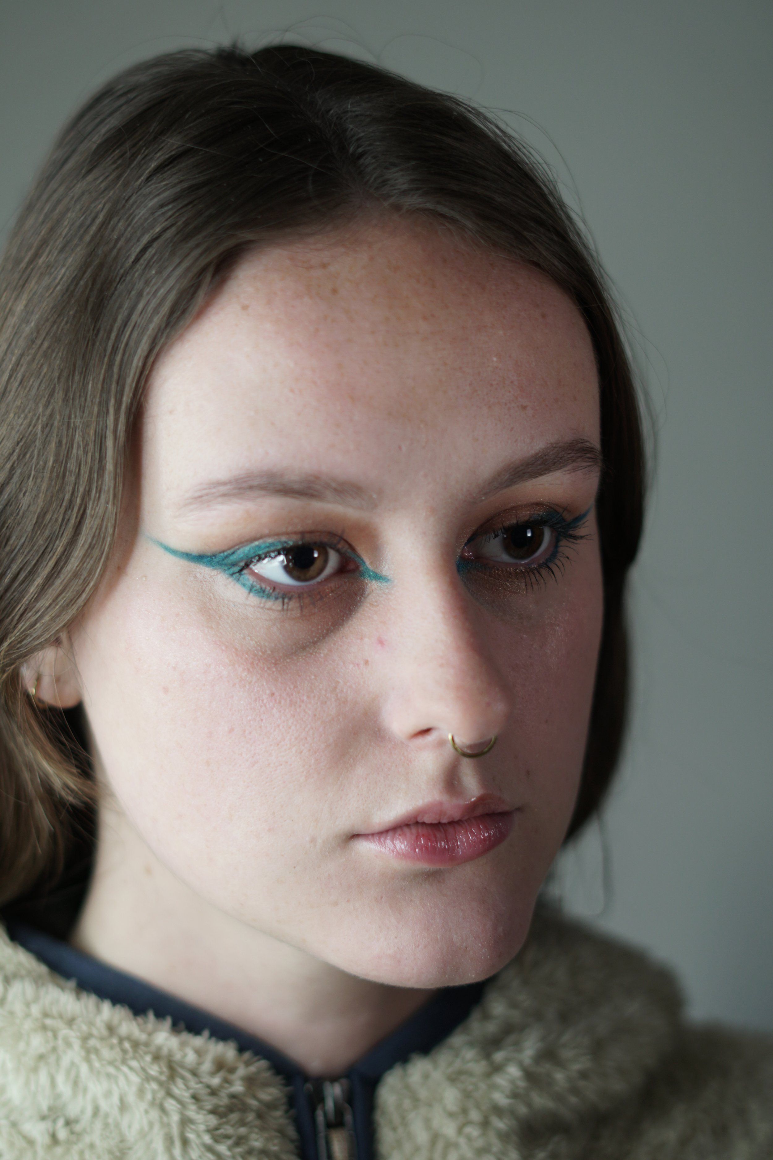
To capture the ethereal and alien nature that the Eternal’s characters reflect, I focused a unique makeup around the eyes. I also implemented a soft key light and an even softer fill light on the subject so that the highlights and shadows weren’t drastic. In post, I added a background gradient as well as a bokeh effect to add to the ethereal atmosphere.
I took the opposite approach when creating a poster for The Batman and used harsh lighting a heavy makeup. Since I knew the poster would be in black and white, I had the key light much brighter than the fill to create a sharper shadow on my face. I also increased the contrast on the areas I applied bruises to as well as added a cut on my cheek. For the background, I used an image of a warehouse and used the lights in the image to create leading lines toward my face. Similar to the bokehs in the Eternals poster, I added dust particles and film blemishes to create a more grungy effect.
To create a Dune character poster, I focused the most on costuming. Since the film takes place on a desert planet, I utilized a black shirt as a makeshift bandana and goggles-like sunglasses for protection from sandstorms. In post, I added a blue and green filter as well as increased noise to create an old, dusty effect. I also added a sand dune into the background so my character’s costuming looks practical.


